
visual brand identity design
Karolina Blaszkiewicz
a case study

the gist
Karolina Blaszkiewicz is a feminine confidence and love coach who works with women to find their inner power, and be able to accept love.
Our goal was to raise her following and reach new audiences through a refined visual brand identity.
scope of work
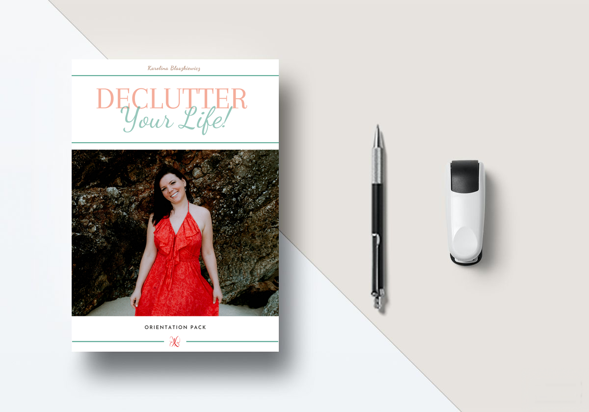
Visual Brand Identity Design
Brand Positioning
Social Media Branding Collateral
Website Aesthetic Consultation

the nature of women
Karolina uses theta and energy healing to help women uncover their strength and truly discover what they want and need out of relationships. Because of the importance of inner strength and natural energy, we decided to take on a holistic approach.
The visual identity of the brand was inspired by natural elements that encourage beauty and life, but are tremendous sources of power. Water, for instance, is an essential part of of earth and way of life. We use it everyday, and have even managed to control it to a degree. But although oceans may be calm and beautiful, they have the power to level entire cities.
Women are much like these elements: essential to maintain life, muses of inspiration and beauty, with a tremendous energy inside that can create big changes in the world.
Karolina’s mission is to extract this power and energy so that each woman can see how much strength and value she really has. And with that energy, she’ll be able to love herself, and let love in from others.

raw energy
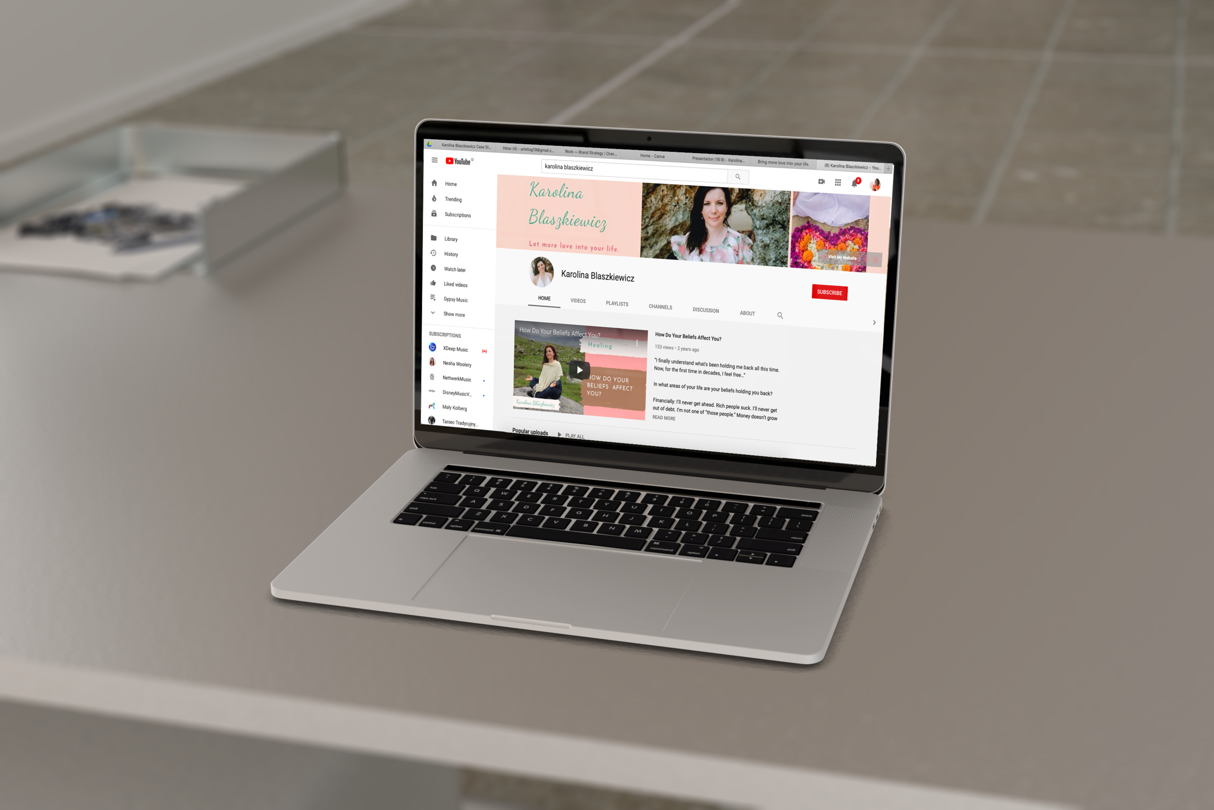
Inspired by our new brand focus, we decided to use new graphics for her website and content. By working with female-empowerment photographer Sandra Kaminska, we were able to capture the raw feminine energy Karolina works for her to reach with her clients. These incredible photographs were the foundation for many pieces of marketing collateral.


a metamorphosis
The change from her original red and green logo came from the understanding that in order for a woman to truly embrace her power, she must first be soft and gentle with herself. After a series of exercises, we determined that ideal brand personality would be feminine, confident, ethereal, warm, with a goddess like energy.
The visual identity now features a softer color combination that is traditionally considered feminine: a rose quartz and teal. Additionally, we make sure to maintain a light and breezy feel by implementing soft earth tones throughout her brand.
The typography used for KB’s signature and logo is Dancing Script. The soft and flowy lines of the text represent how feminine energy is constantly shifting and looping, eternally beautiful and filled with grace. Her complimentary font, Josefina Sans, plays her articles and blog posts in an easy to read and friendly manner.

out of the cocoon
Just like her butterfly logo, Karolina Blaszkiewicz has gone through a metamorphosis. Her brand now reflects her values and beliefs, and resonates with her target audience. Her following grew so much that she was inspired to create a community forum for women in need of conscious connection and guidance. Her mission to guide women to their most radiant selves is gaining traction and turning into a movement of self love, acceptance, and consciousness.


“I couldn't be happier with choosing Arletta as my branding lady. From my first meeting with her to the final step of web design. She has transformed my website, my Social Media and is now helping with my first online course. She just knows what you need.
I love her strategy how she is choosing colours and how she has ability to tune into the business and showing and expressing what is all about through her creation. She always shows such care, professionalism, honesty and creativity for everything related to my brand. I absolutely love what she has created for me and still creating. I highly recommend Arletta’s service.
Thank you.”