logo | visual identity | brand messaging
saya saya designs
a boutique jewelry designer

the gist
Saya Saya is a boutique jewelry company that combines recycled materials with beautiful batik fabrics filled with gorgeous patterns from cultures around the world.
My goal was to create a cohesive visual identity that reflects Saya Saya’s beautiful designs and the values of their ideal clients: adventure, beauty, and gorgeous design.
scope of work
Brand Strategy and Positioning
Visual Brand Identity
Logo
Marketing Collateral

full of life
Since Saya Saya infused patterns from beautiful cultures all over the world, we wanted to be sure to reflect that in both our ideal clients and our visual identity. We began to envision our ideal client: a woman struck with wanderlust who collects a little bit of each place she’s ever been in a unique way. This woman is Adventurous, Bold, Bright, and Full of Life.
brand aesthetic
Now that we knew how we wanted Saya Saya to be portrayed, and what our ideal audience is looking for, we started building the general brand aesthetic. This included bright colors and florals, traditional patterns from various cultures, stark contrasting lines and natural elements showcasing the most vibrant hues.
about the logo
The Saya Saya logo is an expression of the freedom, beauty, and wanderlust that is breathed into each of their unique designs.The trademark, a strellitzia flower, or bird of paradise, is a symbol of freedom and liberation.
Saya Saya’s goal is to let their clients feel the wanderlust, luxury, and express their craving for freedom by adorning themselves with the unique pieces.
patterns
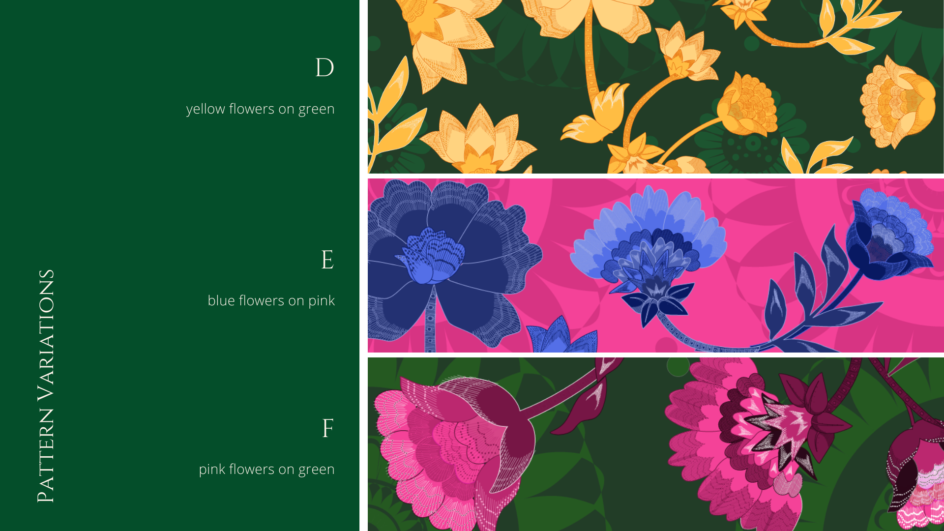
Inspired by traditional batik flowers, fabrics and designs, Saya Saya's patterns incorporate a myriad of flowers and leaves weaving in and out of each other.
Our take on these patterns include bright colors, that when paired together give the design a contemporary feel that incites curiosity, wanderlust, and a desire to strive for more.


